SWIV SPICED SELTZER.
Featured:
Illustration, Lettering, Packaging
2022
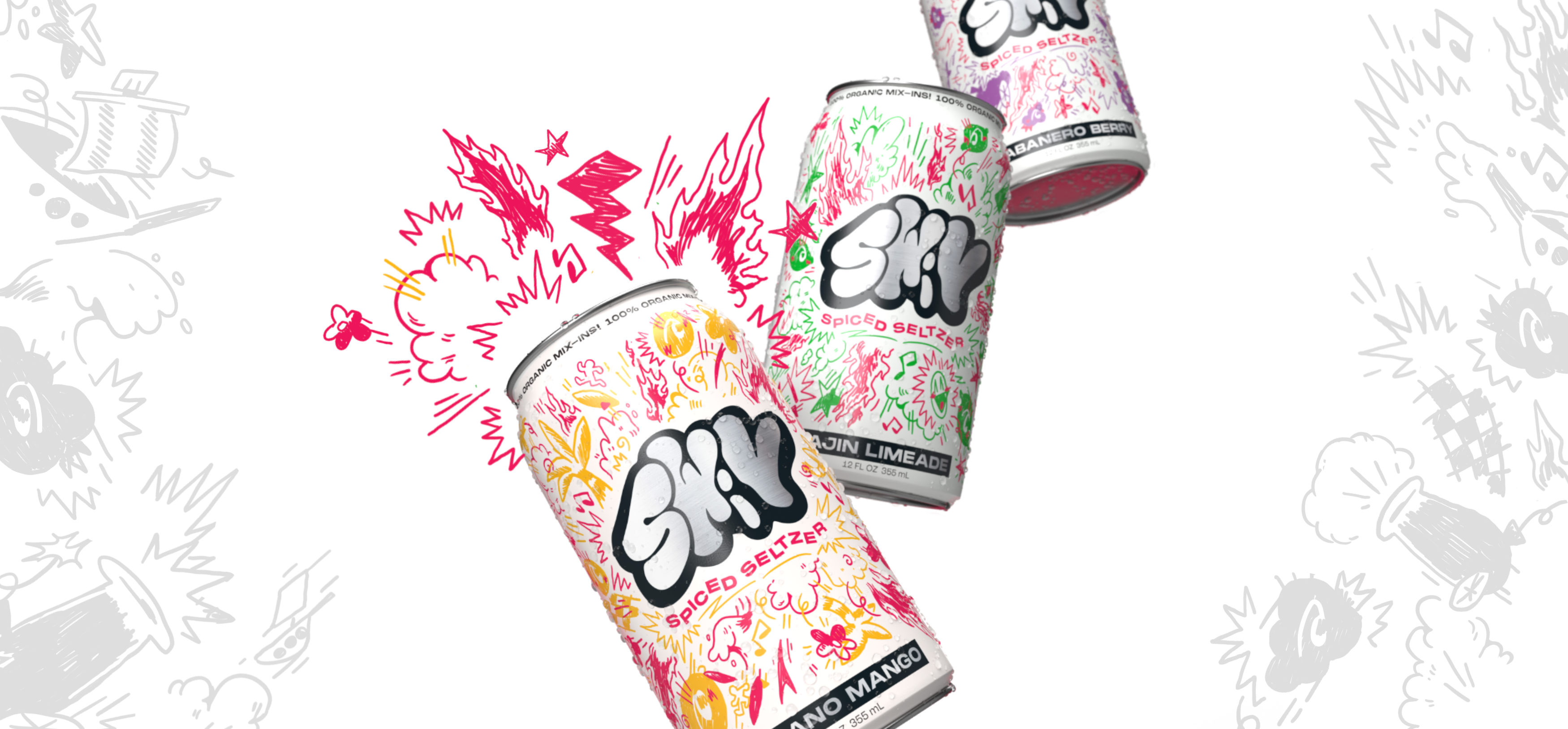
SWIV was born from countless people telling me that seltzer often didn’t taste like anything. So, not only did I dream up flavors with a kick, but I wanted SWIV’s visuals to have the same attitude.
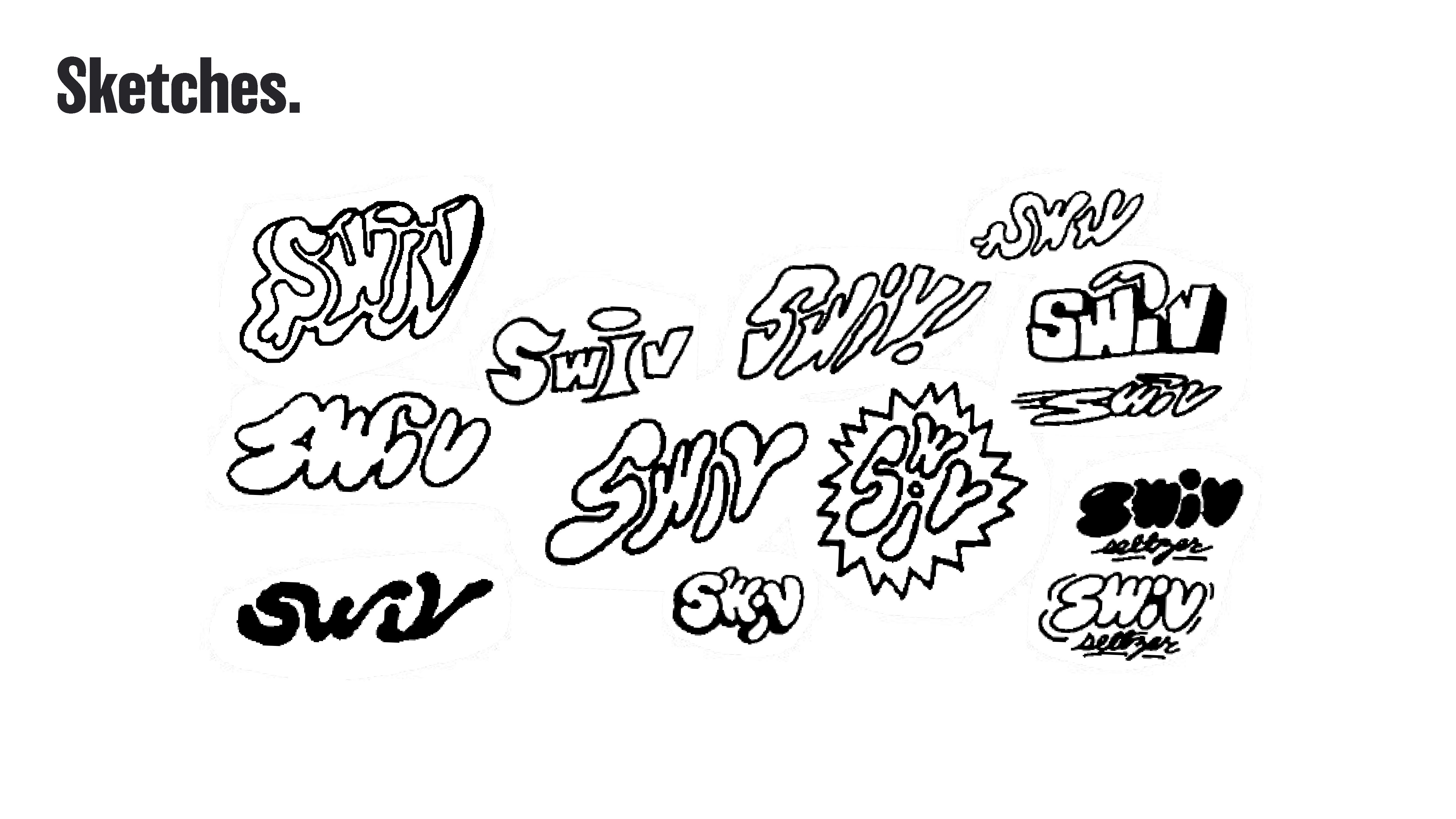
With sketchbook-esque illustrated elements, graffiti-style hand lettering, and exposed can metal, the can shouts off the shelf.
With sketchbook-esque illustrated elements, graffiti-style hand lettering, and exposed can metal, the can shouts off the shelf.


To contrast the handlettered and illustrated elements of the brand, I chose larger geometric sans-serif fonts for header and body copy, keeping it in black, white, and metal throughout.
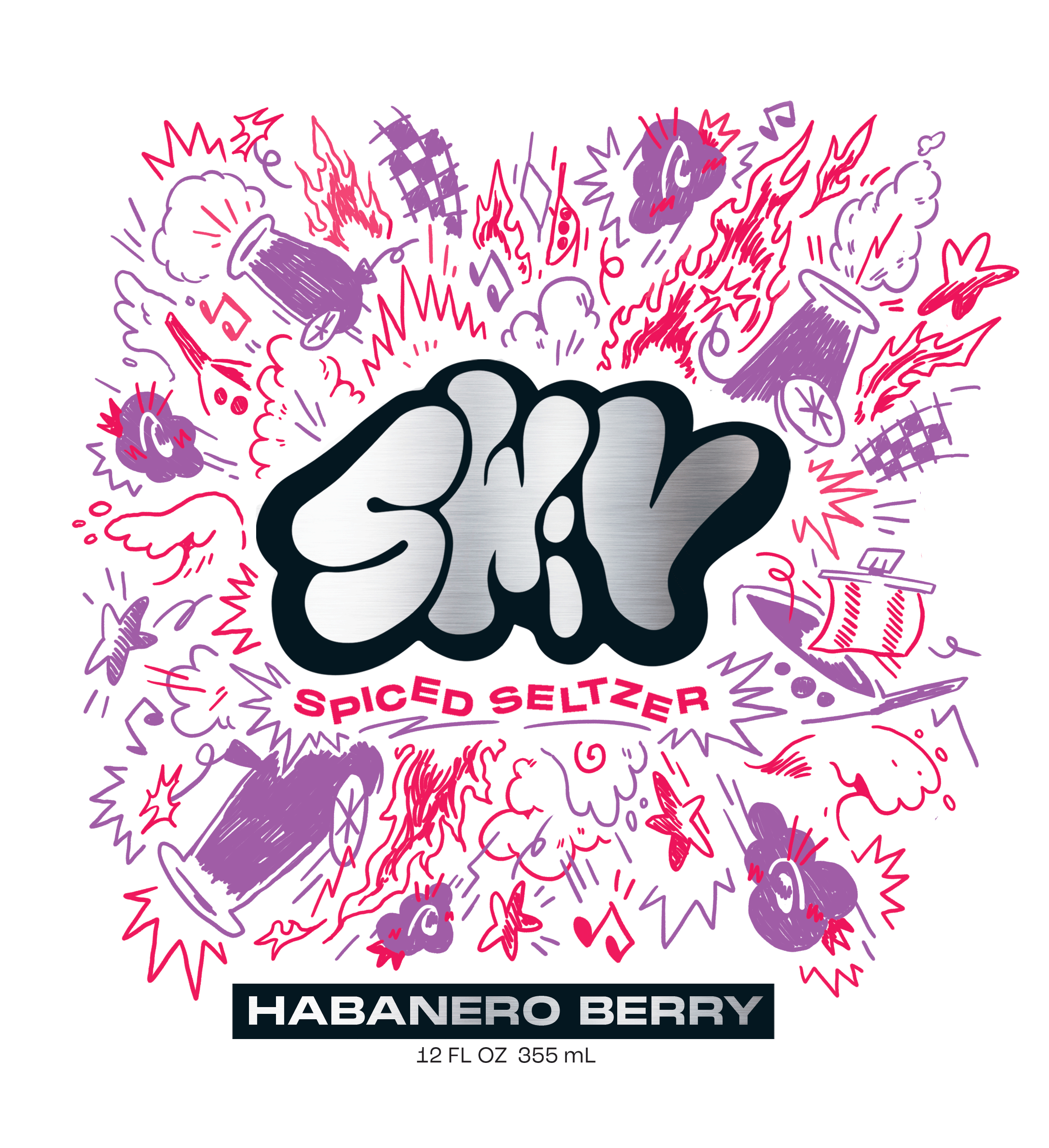

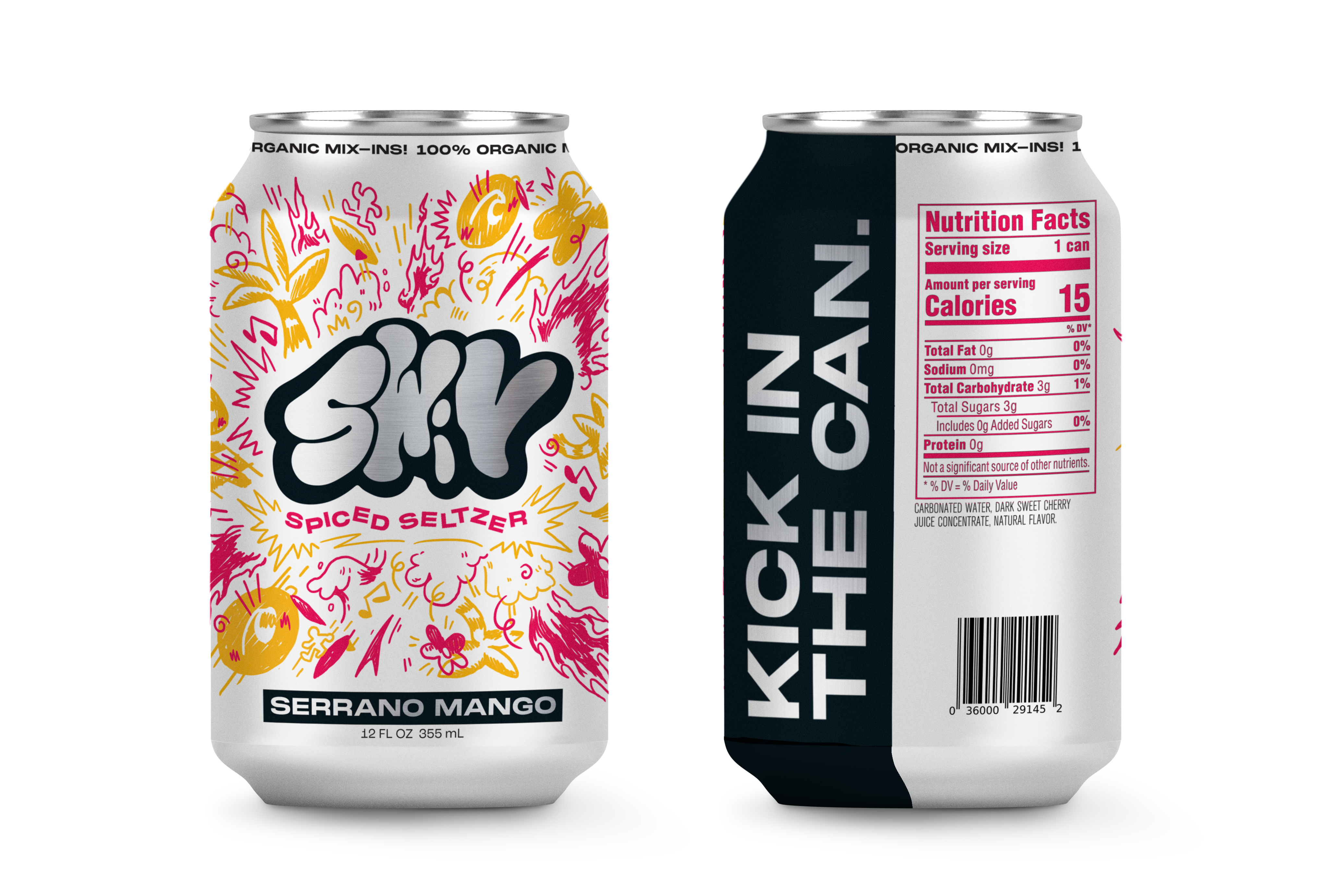
For the can’s design, I wanted to add a pop of exposed metal through the inside of the wordmark, and on the phrase on the side of the can. The “Kick in the can” is placed so when someone drinks from the can, the catchphrase is visible to those around.