ALEXANDER A. GOLDFARB JURIED STUDENT EXHIBITION 2023.
Featured:
Branding, Poster Design, Lettering
Client:
Hartford Art School Galleries
2022
As the first student chosen to brand this exhibition tied so closely to the Hartford Art School community, I felt like I needed to dive deep into concept.
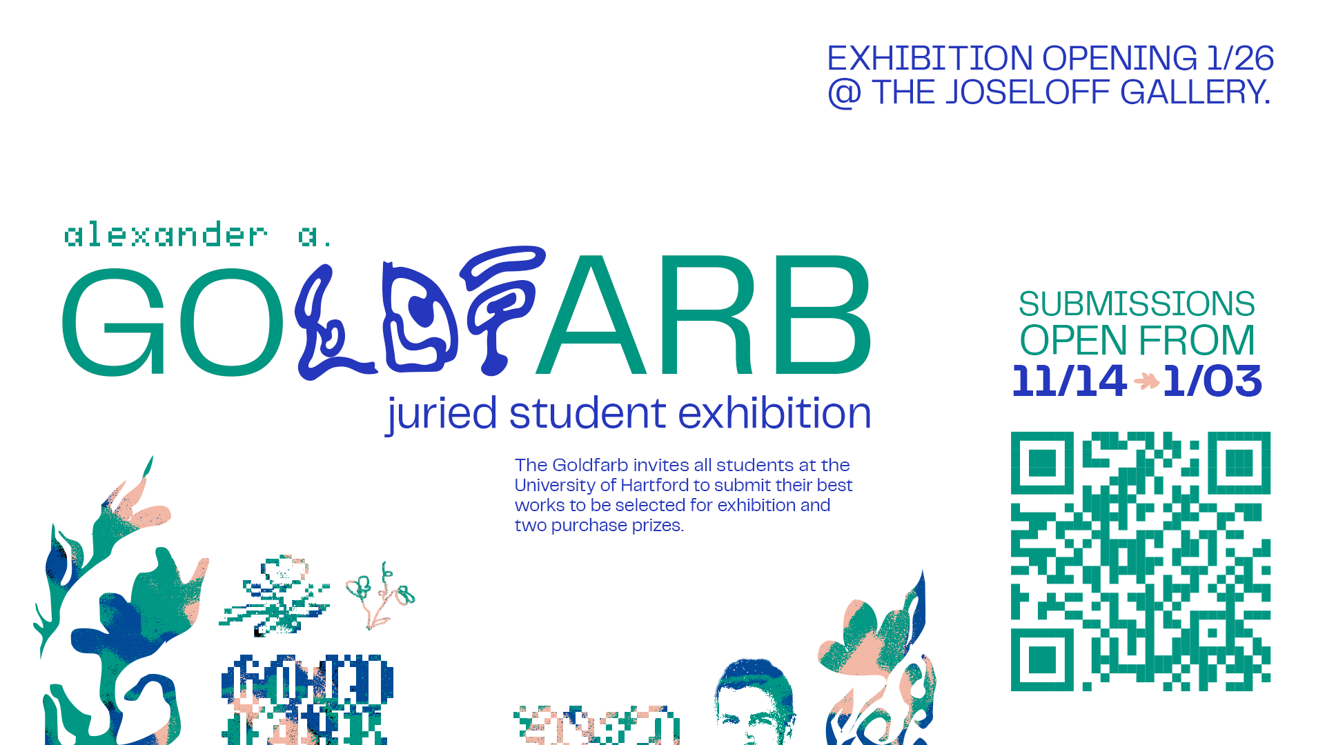
Working with gallery director Carrie Cushman, I aimed to show a dichotomy between both the history of the school and the boundless capabilities of the students entering. Utilizing techniques that have both digital and analog qualities, and a distinct grid-based poster layout, the 2023 exhibition has an identity all its’ own.
Working with gallery director Carrie Cushman, I aimed to show a dichotomy between both the history of the school and the boundless capabilities of the students entering. Utilizing techniques that have both digital and analog qualities, and a distinct grid-based poster layout, the 2023 exhibition has an identity all its’ own.
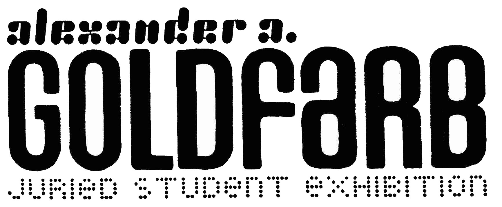
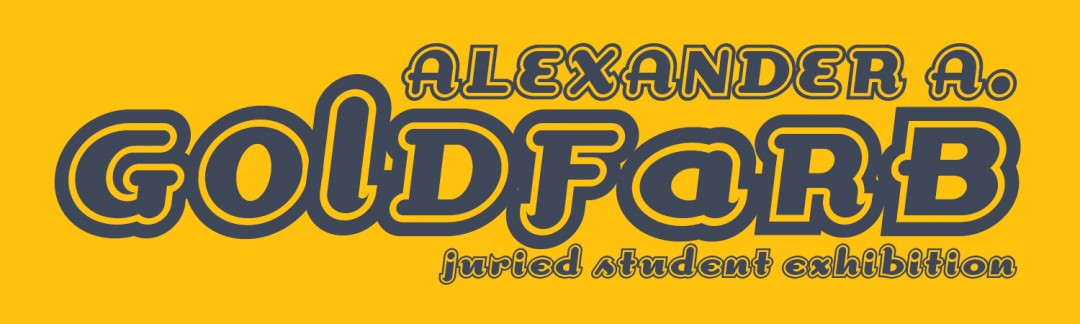

As reference, I reviewed former designs used to brand the exhibition. In the past, exhibition wordmarks often felt like throwbacks to the 90s-early 00s with minimal color usage and bubbly typography.

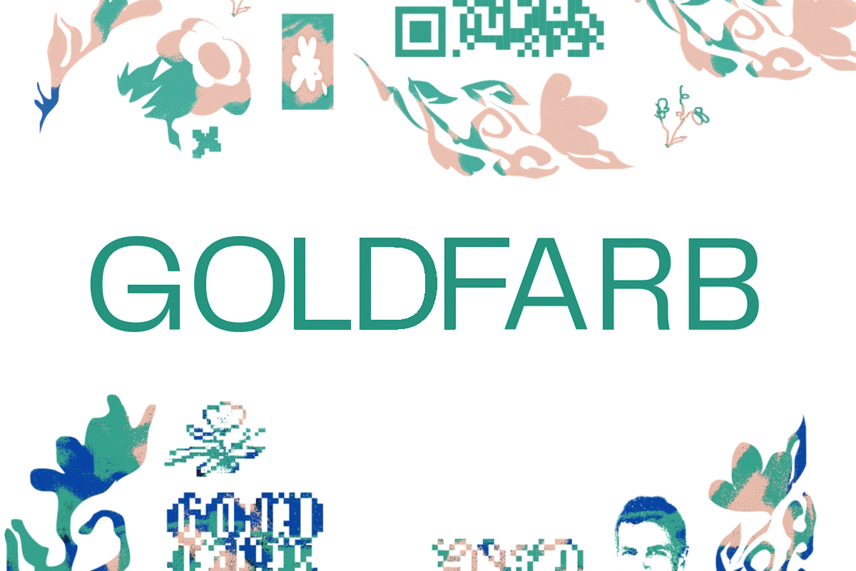
For the visual structure of the brand, a blocky grid system was devised for the visuals. I wanted imagery to feel impactful, yet wavering in the inbetween of digital and analog. Integrating the QR code as part of the illustration through other pixelated imagery allows it to not feel out of place.

Expanding the poster to 11x17in and changing the wordmark strengthened this composition tenfold. For the color palette pitches above, I wanted it to feel sophisticated yet bold and artistic.
Below is the final color palette and texture work.
Below is the final color palette and texture work.
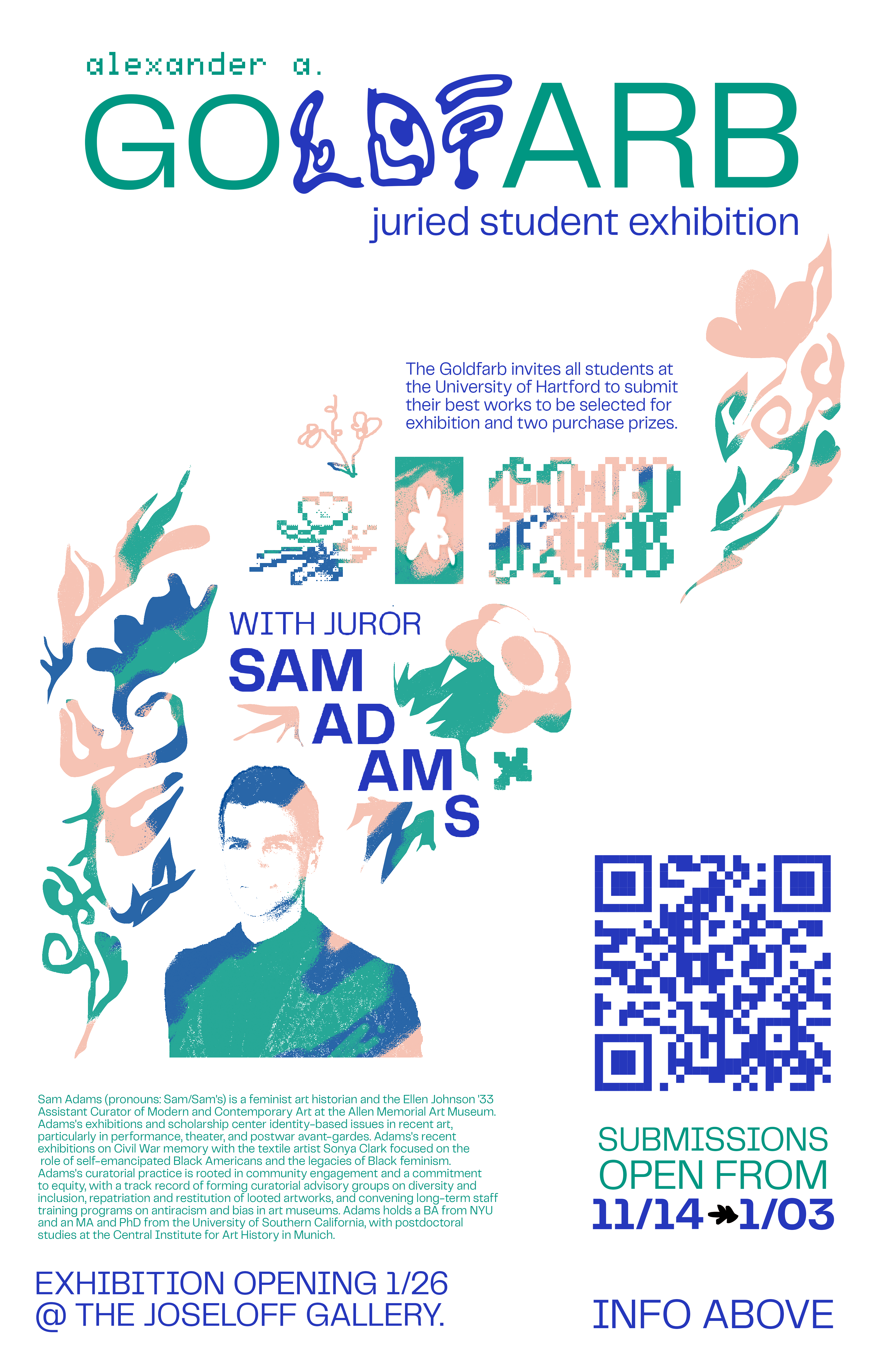
The green, blue and cream palette adds to the digital flowers throughout the flyer. To continue the theme of dichotomy, I created a pattern of brushstrokes to introduce the colors throughout, clashing against the clear boundaries of each illustration.

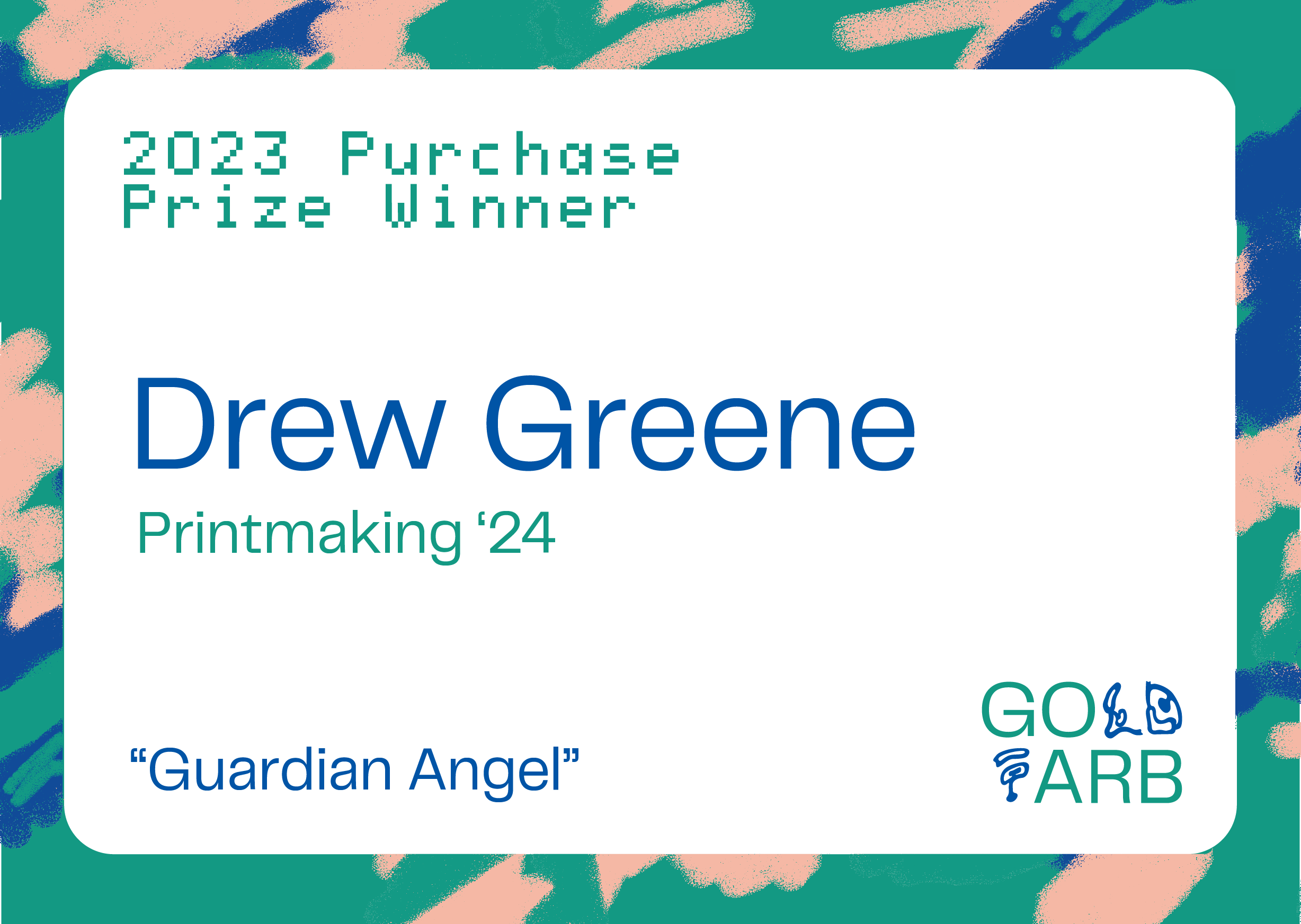
To highlight the two purchase prize winners, the main draw of the exhibition for students, I designed unique plaques for both.